

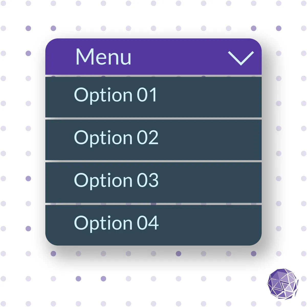
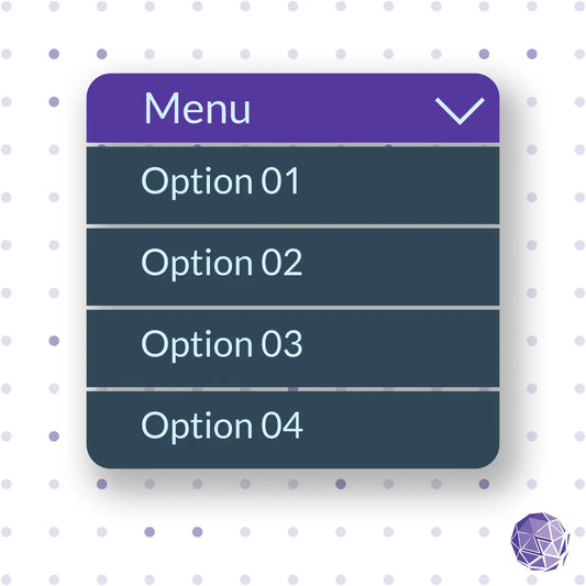
Zenyth ADK Disclosure Component – WCAG 2.2 Compliant Accessible Show/Hide Pattern
Zenyth ADK Disclosure Component – WCAG 2.2 Compliant Accessible Show/Hide Pattern
SKU:
Couldn't load pickup availability

Create inclusive, accessible toggle interactions with Zenyth ADK Disclosure Component, a WCAG 2.2 compliant show/hide solution for dynamic content.
Accessible Toggled Content for Every Project
The Zenyth ADK Disclosure Component provides a lightweight, fully accessible solution for managing expandable or collapsible content. Designed to meet WCAG 2.2 AA standards, it ensures that toggled content - such as FAQs, collapsible panels, or hidden details - is accessible to all users, including those relying on assistive technologies.
Cross-Platform Compatibility
Engineered for flexibility, this component works across platforms such as WordPress, Webflow, BigCommerce, Magento, React, Angular, and more. It supports ARIA attributes, keyboard navigation, and focus management to ensure users can open, close, and navigate toggled content with ease. Its responsive design adapts to any environment, maintaining usability and performance across devices.
Customizable and Developer-Friendly
Developers can easily adapt the ADK Disclosure Component to different use cases through adjustable styles, behaviors, and content configurations. Clear code structure and documentation make it simple to integrate into any project without compromising accessibility or visual consistency.
Sold Individually with Ongoing Updates
Offered as a standalone ADK product, the Disclosure Component allows teams to add accessible show/hide functionality without purchasing the full kit. Each purchase includes one year of Zenyth updates, ensuring continued WCAG conformance, code refinements, and improved implementation guidance.
Features
- WCAG 2.2 AA compliant show/hide pattern
- Cross-platform compatibility (WordPress, Webflow, BigCommerce, Magento, React, Angular, and more)
- ARIA-compliant markup and full keyboard accessibility
- Responsive design with customizable styles and behavior
- Clear focus management for intuitive user interaction
- Includes one year of Zenyth updates and documentation
Benefits for Developers and Organizations
- Delivers accessible toggled content for all users and devices
- Simplifies development with pre-tested accessibility patterns
- Improves content discoverability and usability
- Ensures WCAG, ADA, and AODA compliance for interactive content
- Reduces maintenance time through modular and adaptable design
- Supported by Zenyth’s continuous accessibility updates
Learn more about Zenyth’s end-to-end accessibility solutions.

-
Zenyth ADK Disclosure Component – WCAG 2.2 Compliant Accessible Show/Hide Pattern
An intuitive show/hide pattern for building accessible, user-friendly toggled content.
One Time PurchaseRegular price $115.00 USD
Regular price
Unit price per -
Accessible Shopify tool for pausing animated GIF images on demand - WCAG 2.2 Compliant
Monthly subscription $50.00
Yearly subscription $510.00
-
Compliance Monitoring Ignite Plan
Accessibility basics with 2 pages reviewed monthly, expert feedback, and archived compliance reports.
Monthly subscription $199.00
Yearly subscription $2,388.00
-
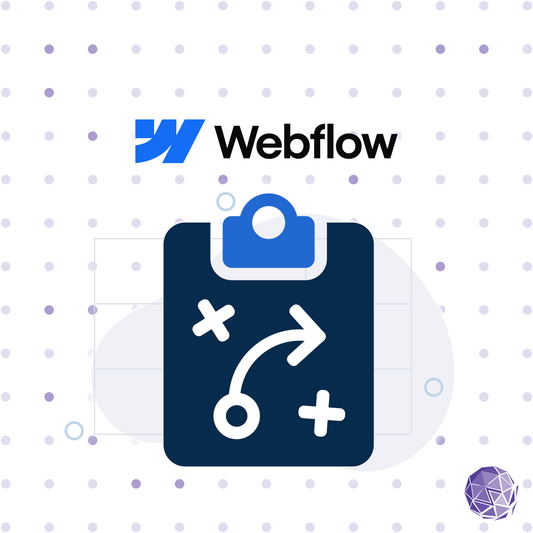
Accessibility Roadmap & Gap Analysis – Build a Clear Path Toward Compliance and Inclusion
Build an accessibility roadmap to identify gaps, prioritize fixes, and integrate accessibility into your workflow.
One Time PurchaseRegular price From $1,500.00 USD
Regular price
Unit price per -
Accessibility Legal Defense Strategy – Expert Guidance for Accessibility Lawsuits and Demand Letters
Comprehensive support and expert guidance to navigate accessibility-related legal challenges.
One Time PurchaseRegular price From $1,500.00 USD
Regular price
Unit price per -
Accessibility Support Desk – Expert Assistance for Teams and End Users
Comprehensive support for internal teams or a dedicated help desk for your users to address accessibility issues.
One Time PurchaseRegular price From $1,500.00 USD
Regular price
Unit price per -
Accessibility Policy Development – Build a Framework for Sustainable Digital Inclusion
Establish a clear accessibility policy to integrate inclusive practices into your organization.
One Time PurchaseRegular price From $1,500.00 USD
Regular price
Unit price per -
Accessibility Legal Compliance Strategy – Navigate ADA, EAA, AODA, and Section 508 Requirements
A proactive approach to mitigate legal risks and ensure compliance with accessibility regulations.
One Time PurchaseRegular price From $1,500.00 USD
Regular price
Unit price per -
Accessibility Maturity Assessment – Evaluate and Advance Your Accessibility Program
A strategic evaluation to measure and enhance your organization's accessibility maturity.
One Time PurchaseRegular price From $1,500.00 USD
Regular price
Unit price per -
A11y Alt - Image Text Alternative Generator
Our solution is tailored for companies facing the often-overlooked challenge of managing alternative text.
One Time PurchaseRegular price From $625.00 USD
Regular price
Unit price per -
Compliance Monitoring Velocity Plan
Advanced monitoring with 6 pages reviewed monthly, detailed documentation, and expert accessibility support.
Monthly Subscription $599.00
Yearly Subscription $7,188.00
-
Compliance Monitoring Orbit Plan
Comprehensive support with 4 pages reviewed monthly, actionable recommendations, and expert accessibility guidance
Monthly Subscription $399.00
Yearly subscription $4,788.00
-
Shopify Development Subscription – Continuous Remediation, Enhancements, and Expert Oversight
Ongoing accessibility-focused Shopify development, remediation, and support for any theme.
One Time PurchaseRegular price From $1,000.00 USD
Regular price
Unit price per -
Professional Shopify Development – Scale and Optimize for Accessibility and Performance
A Shopify solution for businesses looking to maximize their store’s potential with advanced features that scale
One Time PurchaseRegular price $14,400.00 USD
Regular price
Unit price per -
Foundation Plus Shopify Development – Rebuild for Accessibility and Performance
A Shopify solution for expanding your online store with enhanced features and flexibility
One Time PurchaseRegular price $9,900.00 USD
Regular price
Unit price per -
Foundation Shopify Development – Build an Accessible Shopify Storefront
A streamlined solution for launching your Shopify store with essential features and accessibility built in
One Time PurchaseRegular price $4,900.00 USD
Regular price
Unit price per -
Foundation Webflow Development – Accessible Webflow Rebuild
Launch a modern, accessible Webflow site built for growth, brand impact, and long-term performance.
One Time PurchaseRegular price $5,500.00 USD
Regular price
Unit price per -
Foundation Plus Webflow Development – Expand Your Accessible Web Presence
Rebuild or enhance your Webflow site with expanded content, refined design, and advanced CMS functionality.
One Time PurchaseRegular price $6,500.00 USD
Regular price
Unit price per -
Professional Webflow Development – Advance Your Accessible Digital Experience
Elevate your Webflow site with advanced design, expanded structure, and integrated content strategies.
One Time PurchaseRegular price $10,500.00 USD
Regular price
Unit price per -
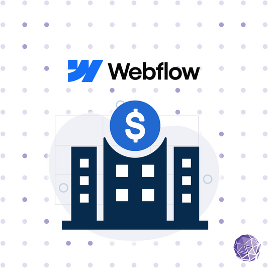
Enterprise Webflow Development – Build a Fully Custom, Accessible and Scalable Web Experience
Launch a fully custom, accessible Webflow experience for enterprise growth and flexibility.
One Time PurchaseRegular price $14,500.00 USD
Regular price
Unit price per -
Accessible Webflow Development Subscription – Continuous Accessible Site Growth
Ongoing accessibility-focused Webflow development, updates, and support tailored to your organization’s needs.
One Time PurchaseRegular price From $1,000.00 USD
Regular price
Unit price per -
Robust compliance audits with ongoing monitoring, ensuring your website targets the latest accessibility standards
One Time PurchaseRegular price $7,600.00 USD
Regular price
Unit price per -
Provides thorough manual audits for keyboard users, laying a solid foundation for inclusivity
One Time PurchaseRegular price $6,175.00 USD
Regular price
Unit price per -
Upgrade for broader error detection and fixes with WAVE, taking your site's accessibility up a notch
One Time PurchaseRegular price $4,275.00 USD
Regular price
Unit price per -
Kickstart accessibility with this package, offering essential Axe Error fixes to begin your compliance journey
One Time PurchaseRegular price $2,850.00 USD
Regular price
Unit price per

