
Shopify Featured List
Shopify Featured List
Monthly subscription $100.0
Yearly subscription $1020.0
SKU:
Não foi possível carregar a disponibilidade de retirada.

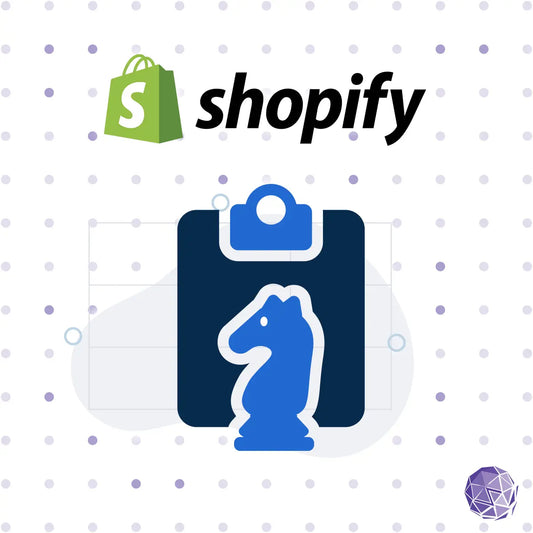
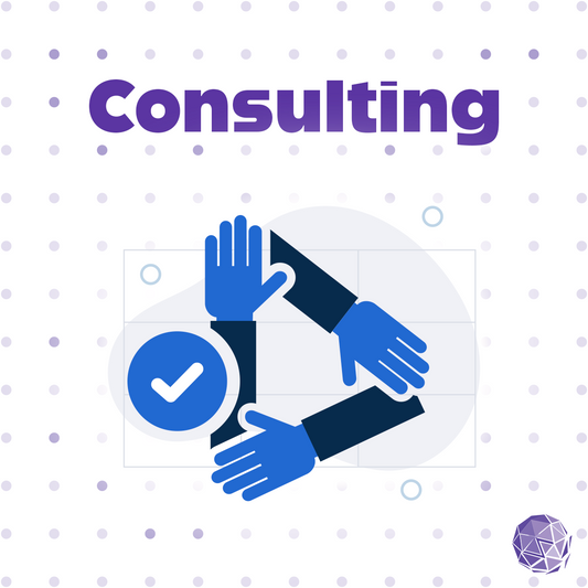
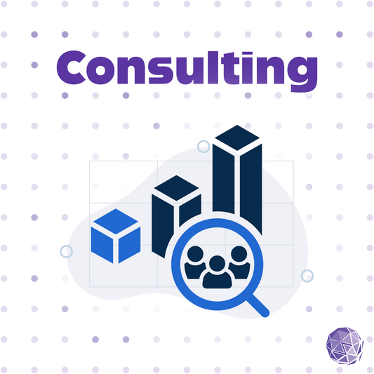
Empower merchants to create versatile, accessible content showcases with flexible layouts, comprehensive product card functionality, and full WCAG 2.2 compliance, creating engaging and inclusive shopping experiences.
Address Content Showcase and Accessibility with Confidence
Flexible content showcases can significantly enhance customer engagement and product discovery, but without proper accessibility controls and consistent product card functionality, they can create barriers for customers using assistive technologies or keyboard navigation. The Zenyth Featured List component provides a comprehensive, accessible solution that meets WCAG 2.2 requirements by ensuring full keyboard navigation, screen reader support, and proper ARIA implementation, while delivering rich product card functionality through the integrated zenyth-card-product.liquid snippet.
Seamless Integration for Shopify Stores
Developed specifically for Shopify, this accessibility-first component installs easily into any theme and automatically integrates with your product catalog, collections, blog posts, and pages. The component uses the zenyth-card-product.liquid snippet to provide rich product card functionality including variant selection, add to cart, quick view, and social sharing. A clean, responsive interface allows customers to explore products, collections, and content in flexible grid or carousel layouts. The solution works across devices and browsers, ensuring consistent behavior for all visitors.
Built-In Accessibility and Usability Standards
Zenyth's Featured List component includes ARIA labels, keyboard focus management, screen reader announcements, and visible states for all controls, ensuring full compatibility with assistive technologies. The component integrates seamlessly with the zenyth-card-product.liquid snippet, which provides comprehensive product card accessibility features including accessible color swatches, keyboard-navigable variant selectors, and proper form controls. The component is designed for easy customization, allowing developers to match brand styles while maintaining accessibility integrity. It is an effortless way to make your store more compliant, inclusive, and user-friendly.
Part of Zenyth's Accessibility Ecosystem
As part of Zenyth's family of accessible Shopify tools, the Featured List component helps your brand proactively align with WCAG 2.2, ADA, and AODA requirements. It's ideal for merchants seeking to enhance accessibility without adding technical overhead or redesigning their store, while providing rich product card functionality through the integrated product card snippet.
Features
- Flexible content types: products, collections, blog posts, pages, and custom cards
- Rich product card functionality via zenyth-card-product.liquid snippet
- Grid or carousel display with responsive column controls
- Optional main image with content overlay
- Collection products block for displaying multiple products from a collection
- Fully compliant with WCAG 2.2 Level AA standards
- Integrated ARIA labels and keyboard-accessible controls
- Responsive, theme-friendly design compatible with all Shopify templates
- Lightweight installation with efficient rendering
- Built and maintained by Zenyth's accessibility experts
Benefits for Developers and Organizations
- Ensures compliance with accessibility regulations (WCAG 2.2, ADA, AODA)
- Improves user engagement through flexible content showcases and rich product card functionality
- Provides versatility to display products, collections, blog posts, pages, and custom content
- Enhances product discovery with comprehensive product card features (variants, add to cart, quick view)
- Enhances SEO and brand reputation through inclusive design practices
- Minimizes remediation costs by resolving accessibility barriers at the source
- Plug-and-play integration for quick adoption across existing Shopify themes
- Ongoing updates from Zenyth to maintain compliance and performance
Learn more about Zenyth's end-to-end accessibility solutions.

-
Zenyth ADK Disclosure Component – WCAG 2.2 Compliant Accessible Show/Hide Pattern
An intuitive show/hide pattern for building accessible, user-friendly toggled content.
One Time PurchasePreço normal $115.00 USD
Preço normal
Preço unitário por -
Accessible Shopify tool for pausing animated GIF images on demand - WCAG 2.2 Compliant
Monthly subscription $50.00
Yearly subscription $510.00
-
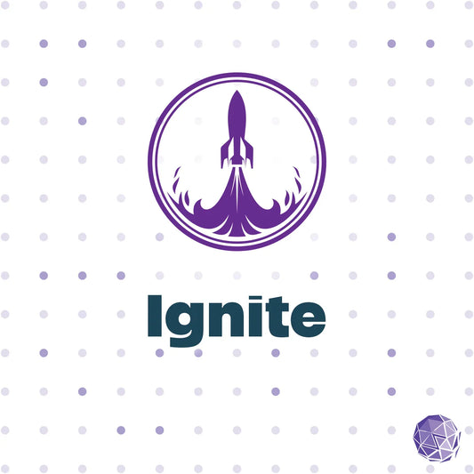
Compliance Monitoring Ignite Plan
Accessibility basics with 2 pages reviewed monthly, expert feedback, and archived compliance reports.
Monthly subscription $199.00
Yearly subscription $2,388.00
-
Accessibility Roadmap & Gap Analysis – Build a Clear Path Toward Compliance and Inclusion
Build an accessibility roadmap to identify gaps, prioritize fixes, and integrate accessibility into your workflow.
One Time PurchasePreço normal De $1,500.00 USD
Preço normal
Preço unitário por -
Accessibility Legal Defense Strategy – Expert Guidance for Accessibility Lawsuits and Demand Letters
Comprehensive support and expert guidance to navigate accessibility-related legal challenges.
One Time PurchasePreço normal De $1,500.00 USD
Preço normal
Preço unitário por -
Accessibility Support Desk – Expert Assistance for Teams and End Users
Comprehensive support for internal teams or a dedicated help desk for your users to address accessibility issues.
One Time PurchasePreço normal De $1,500.00 USD
Preço normal
Preço unitário por -
Accessibility Policy Development – Build a Framework for Sustainable Digital Inclusion
Establish a clear accessibility policy to integrate inclusive practices into your organization.
One Time PurchasePreço normal De $1,500.00 USD
Preço normal
Preço unitário por -
Accessibility Legal Compliance Strategy – Navigate ADA, EAA, AODA, and Section 508 Requirements
A proactive approach to mitigate legal risks and ensure compliance with accessibility regulations.
One Time PurchasePreço normal De $1,500.00 USD
Preço normal
Preço unitário por -
Accessibility Maturity Assessment – Evaluate and Advance Your Accessibility Program
A strategic evaluation to measure and enhance your organization's accessibility maturity.
One Time PurchasePreço normal De $1,500.00 USD
Preço normal
Preço unitário por -
A11y Alt - Image Text Alternative Generator
Our solution is tailored for companies facing the often-overlooked challenge of managing alternative text.
One Time PurchasePreço normal De $625.00 USD
Preço normal
Preço unitário por -
Compliance Monitoring Velocity Plan
Advanced monitoring with 6 pages reviewed monthly, detailed documentation, and expert accessibility support.
Monthly Subscription $599.00
Yearly Subscription $7,188.00
-
Compliance Monitoring Orbit Plan
Comprehensive support with 4 pages reviewed monthly, actionable recommendations, and expert accessibility guidance
Monthly Subscription $399.00
Yearly subscription $4,788.00
-
Shopify Development Subscription – Continuous Remediation, Enhancements, and Expert Oversight
Ongoing accessibility-focused Shopify development, remediation, and support for any theme.
One Time PurchasePreço normal De $1,000.00 USD
Preço normal
Preço unitário por -
Professional Shopify Development – Scale and Optimize for Accessibility and Performance
A Shopify solution for businesses looking to maximize their store’s potential with advanced features that scale
One Time PurchasePreço normal $14,400.00 USD
Preço normal
Preço unitário por -
Foundation Plus Shopify Development – Rebuild for Accessibility and Performance
A Shopify solution for expanding your online store with enhanced features and flexibility
One Time PurchasePreço normal $9,900.00 USD
Preço normal
Preço unitário por -
Foundation Shopify Development – Build an Accessible Shopify Storefront
A streamlined solution for launching your Shopify store with essential features and accessibility built in
One Time PurchasePreço normal $4,900.00 USD
Preço normal
Preço unitário por -
Foundation Webflow Development – Accessible Webflow Rebuild
Launch a modern, accessible Webflow site built for growth, brand impact, and long-term performance.
One Time PurchasePreço normal $5,500.00 USD
Preço normal
Preço unitário por -
Foundation Plus Webflow Development – Expand Your Accessible Web Presence
Rebuild or enhance your Webflow site with expanded content, refined design, and advanced CMS functionality.
One Time PurchasePreço normal $6,500.00 USD
Preço normal
Preço unitário por -
Professional Webflow Development – Advance Your Accessible Digital Experience
Elevate your Webflow site with advanced design, expanded structure, and integrated content strategies.
One Time PurchasePreço normal $10,500.00 USD
Preço normal
Preço unitário por -
Enterprise Webflow Development – Build a Fully Custom, Accessible and Scalable Web Experience
Launch a fully custom, accessible Webflow experience for enterprise growth and flexibility.
One Time PurchasePreço normal $14,500.00 USD
Preço normal
Preço unitário por -
Accessible Webflow Development Subscription – Continuous Accessible Site Growth
Ongoing accessibility-focused Webflow development, updates, and support tailored to your organization’s needs.
One Time PurchasePreço normal De $1,000.00 USD
Preço normal
Preço unitário por -
Robust compliance audits with ongoing monitoring, ensuring your website targets the latest accessibility standards
One Time PurchasePreço normal $7,600.00 USD
Preço normal
Preço unitário por -
Provides thorough manual audits for keyboard users, laying a solid foundation for inclusivity
One Time PurchasePreço normal $6,175.00 USD
Preço normal
Preço unitário por -
Upgrade for broader error detection and fixes with WAVE, taking your site's accessibility up a notch
One Time PurchasePreço normal $4,275.00 USD
Preço normal
Preço unitário por -
Kickstart accessibility with this package, offering essential Axe Error fixes to begin your compliance journey
One Time PurchasePreço normal $2,850.00 USD
Preço normal
Preço unitário por

